

Project Overview
Grailed Website Redesign
Role: UX Design, User research, Prototyping, Usability Testing
Tools: Figma, Photoshop, Lightroom
GRAILED
Grailed is a curated community marketplace for men's clothing. Their goal is to make great clothing affordable and available to everyone. Grailed has a unique collection that focuses on the peer-to-peer community. Much more than a commerce platform, they serve as a central hub for enthusiasts to come together.
Problem design and hypothesis
After going through countless reviews and interviews regarding Grailed, some common issues were brought up by multiple users.
I wanted to hear everyone’s thoughts and concerns because I would like to create a similar platform on my own in the future. I thought it would be a great idea to see how one of the top platforms operated and see what the buzz was all about.
The solution
After listening to multiple users and hearing their frustrations and pain points, I wanted to improve on the overall design of the platform to make sure future users would have a more enjoyable experience.
The goal for this design is to ensure that these users have a seamless transition going from browsing clothes and to actually purchasing them. The redesign should make the search process more intuitive to the user. Time spent browsing would also be reduced with these changes.
In order to achieve these outcomes, I chose to focus on using different methods. This design process includes research, heuristic analysis, visual design, content hierarchy, user testing, prototyping and iterations.

Content hierarchy and lack of consistency may confuse the users

Heuristic Analysis
By referring to and using Jakob Nielsen's 10 general principles for interaction design, I was able to recognize areas for improvement on the website. By pinpointing these areas of concern, it allowed me to make quality changes to cater to the users’ needs and expectations when browsing the website.
Consistency and standards
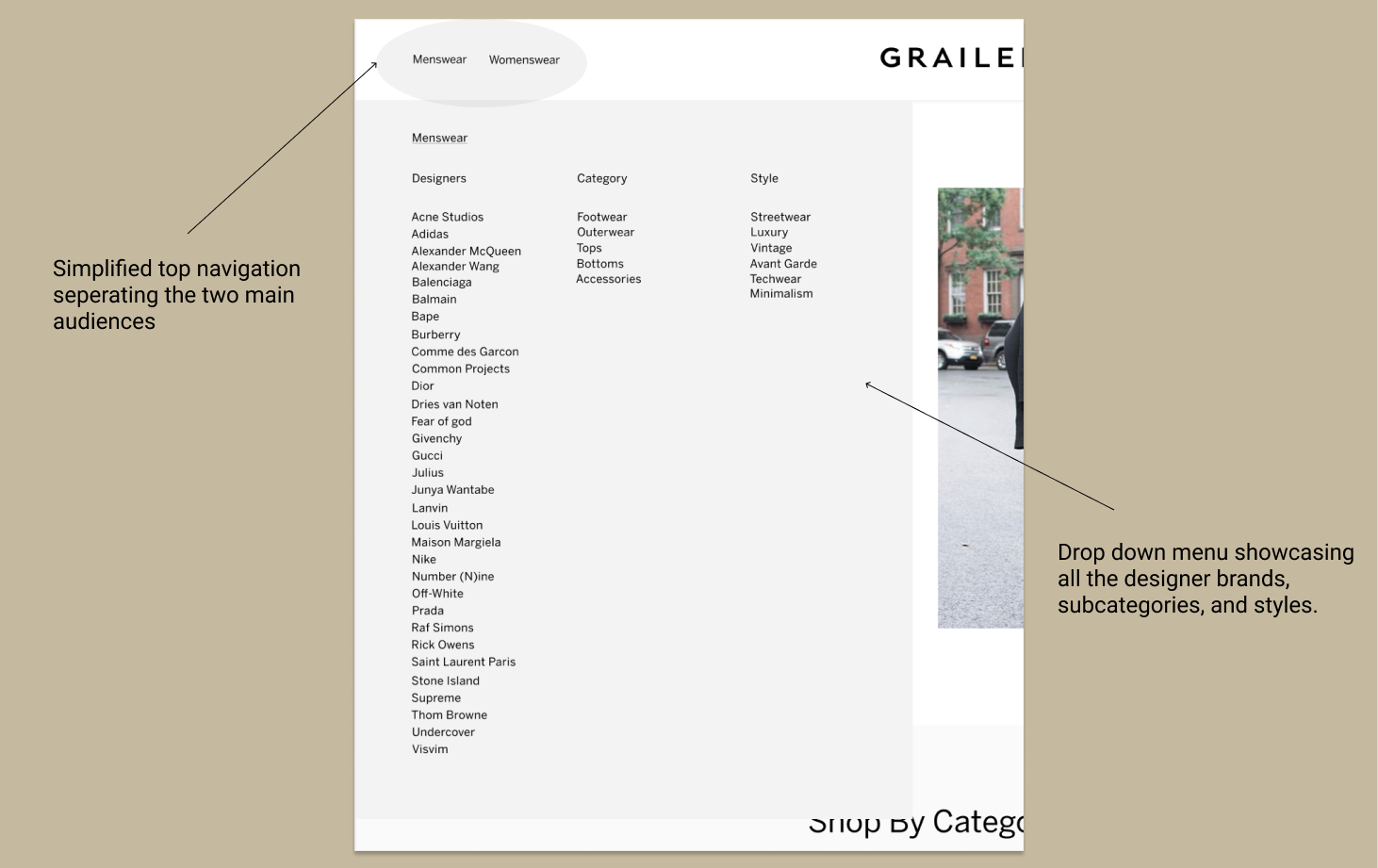
There seemed to be an issue with consistency for the navigation bar on the homepage. The repetition of categories was overwhelming and lacked a consistent pattern or order. Content hierarchy needed to be addressed. Many of the same categories lead to the same pages on the website. The excessive amount of categories could lead users into confusion and cause disinterest in continuing to shop.
Recognition rather than recall
The repetition of categories can also cause cognitive overload. Users should be able to recognize where look for specific categories rather than spending tine trying to determine if they are even heading in the right direction.
Aesthetic and minimal design
The excessive amounts of categories causes clutter and has a negative effect on the users’ attention. The categories should be limited to only the necessary components for the users’ to achieve their end goal in finding the products that they need.

User Testing
Besides my use of Nielsen’s principles of design, I wanted to make sure that I was not biased in my assumptions. I interviewed a total of 10 users who used or at least heard of Grailed. I also made sure that they had experience of using other similar platforms such as Depop and Poshmark. 6 of the users were males and 4 were females all ranging from the ages of 19-30. Even though Grailed almost specifically targets males, they also have a good amount of females constantly buying clothes through their commercial peer-to-peer platform.
Careful analysis of actions and comments were taken during these interviews through Zoom interviews. From there, I was able to take note of their motivations, frustrations and pain points.
Development
With the information collected from the user interviews and reviews from communities such as Reddit, I was able to create an affinity diagram of all the responses. From these responses I was able to see some commonalities between the motivations, frustrations and pain points of all the users combined. I was able to create two different personas to account for the two types of people who use these type of platforms.
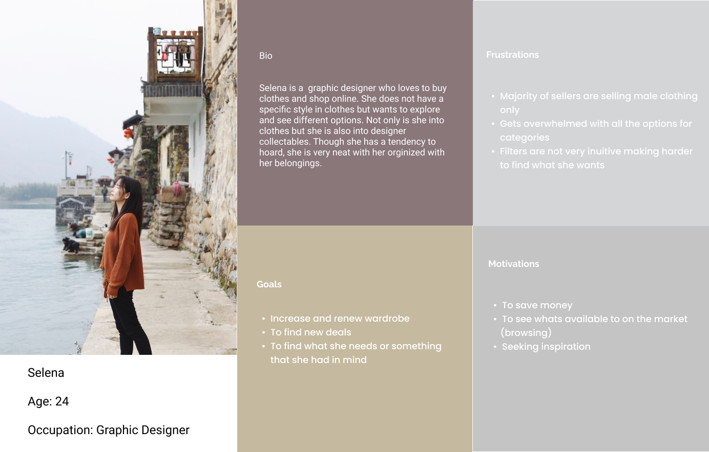
The Buyer

The Seller

Sketches
Once I had the general idea of what type of users made up the majority of the website, I grabbed a pen and started brainstorming some ideas. I wanted to make the quality of life better users so I made sure to keep their needs in mind when designing these pages.

Minimalistic Approach
Once I had the fundamental building blocks all sketched out, I wanted to begin creating low-mid fidelity prototypes. I created a style guide with a very to easy read font with minimal colors. Many users said that they wanted to go through the buying process as quick as possible while still enjoying the content provided by Grailed. To ensure this, I made sure to stick to Grailed’s monochromatic color theme to allow the products to stand out more during the browsing process. This goes back to Nielsen’s guidelines for user interface design. An aesthetic and minimal design will lead to less clutter and less distraction to the users.

Simplicity
Initial reactions from the user testing of Grailed’s website led me to believe that the content overload on the homepage was detrimental because it did not allow the user traffic to be retained for long periods of time. Content hierarchy needed to be reworked while also made simpler. Users did not know where to look first or how to even proceed to the direction that they needed to go.

Diversification
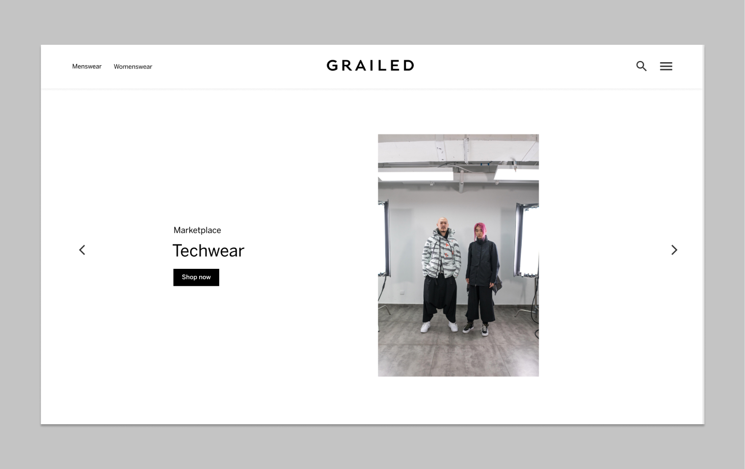
While reading through various communities such as Reddit, it became clear that females did not feel equally welcomed to using the website. Most of the females said that they would like to make some purchases through Grailed but are turned off because of the lack of diversity. All of the images were of males. To counter this and in hopes of bringing more traffic to Grailed, implemented pictures of both males and females. This is important because all of these clothing styles have a lot of both genders participating. It is only fair and right that females are represented in the visual contents of the website.

In effort to make the website redesign more scannable and easier to read, removal of all the previous clutter was needed. The prior navigation bar was repetitive and distracting to the users. So a complete overhaul of the navigation and structure was needed. The purpose of this redesign is too embrace the concept of minimalism by only putting out there what is necessary. Finding the balance between a lack of content and too much was the challenge in creating this designer product work space.
Menus
To also make the website more simplistic and minimal, I decided to take the cluttered navigation bar and integrated it into two main categories for Men and Women. This allows me to reduce the visual clutter that derailed many users from finding their objectives. From these two main categories, it becomes a drop down menu that splits into 3 sub categories of designers, clothing groups, and styles.
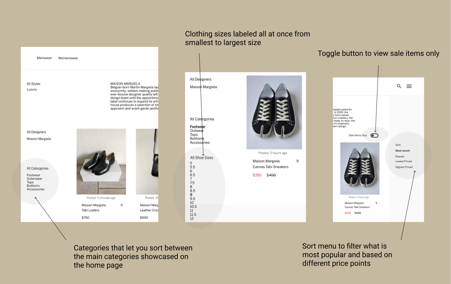
Filters
Users complained that the current filter system was too confusing and overwhelming. I then decided to use card sorting to give me an idea of what to prioritize when it came to categories, styles and sizes. This is helpful to the overall design of the buying process because it makes the process more intuitive to the buyer or seller. I opted for a more friendly laid out approach rather than endless drop down menus. This also improves the visual aspect of the website by making it look cleaner and more modular. A toggle for sale items was also implemented because a lot of users said that they would like to spend less time finding the sale items.

In order to make the buying process as seamless as possible, I made sure to have have all the buying options and buttons on same page. This allows the user to make their purchase while still being able to see all details and information of the product. The seller is also clearly documented for them to allow transparency between the buyer and the seller. A toggle option was also added to the bottom of the page just in case they buyer wanted to now what the trending market prices are for the specific item they are looking at. This was a cause for concern for many users because they did not now if they were getting a good deal or not.