

Project overview
Austin Food & Wine Festival Website Redesign
Role: Research / Information Architecture / Visual Design (Team of 3)
Tools: Figma, Sketch, Photoshop, Miro
Context: Desktop and mobile redesign
Time: 2-week design sprint

Austin Food & Wine Festival
Redesign
Problem and design hypothesis
We wanted to know why people wanted to go to festivals in the first place. To know if they had any struggles purchasing tickets online whether it was through their computers or through their phones. We also wanted to know their preferences. Knowing what they expected from a festival website and knowing exactly how they would natural flow through the site to purchase tickets.
The goal was simple, we needed to incorporate the non-profit, Austin Food and Wine Alliance, and bring more awareness to the local business it serves. An emphasis on the mobile browser integration was also important.
The Solution
We wanted to make sure that the purchasing process would be made as straight forward as possible. Making sure that the design we made would include some very helpful features while keeping it intuitive was our priority. Information architecture was established to set priority to what the user needed to see to make their decision on whether to attend the festival or not.
The festival organizers wanted to include more information about their associated non-profit organization and bring more awareness to the local businesses so we made to implement features that supported these.
What We did
Educational Programming, events and grants were a couple of the areas we wanted touch upon because these brought the most information about the cause of the project. This was needed to establish the meaning behind the festivals work.
Increased awareness was also a priority for the festival goers by letting them know where and when all the events would take place. We made sure the information was made easily accessible to them by taking information architecture very seriously.
4 Ways of integration:
Allocated vendor booth space to grant recipients and culinary school
Grant recipients who have local stores around town
Grant recipients who are involved in farm and dairy
Ticket checkout page - introduction to Alliance & Link
Features
Community and local eats pages integrated on home page to bring more awareness. Portion of ticket purchase cost will be donated to the partner, Austin Food and Wine Festival.

Downloadable Vendor and Amenities Map
While we incorporated a downloadable schedule on the home page for easy access to the user, we wanted to make sure that they had a very user-friendly method to see a map.

Chef Showcase Lineup
Allows you the flexibility to see what time each chef was showing at which stage. I also incorporated a way for the user to make a schedule that they could forward to their email after so they could save their schedule on the phone

Community Driven
By showcasing the community aspects of the site very early in the content hierarchy of our home page, we were able to really bring attention to the Austin Food and Wine Alliance. Each activity is carefully spaced with empathetic images to increase interest with the users.

Partner Hotels & Local Eats
An interactive map was made to create a very user-friendly experience. We wanted to make the whole process of booking a hotel and looking for places to eat very seamless by making sure they hav all the information they need without the design being to overbearing.

Friendly and Welcoming
We really wanted to make sure that we could give the user a taste of what the festival would look like while also having the chance to see whats else is happening around the area We wanted to make them feel as if they were already there to make them look forward to the event. Building the anticipation and excitement was all part of the process.

Visual Design
Since I wanted to bring the experience to our users, I made sure to incorporate visual banners and clickable images to allow the user to navigate through the site. I felt like this approached worked well because images do speak louder than words when the main focus for the user is to see who’s performing, see what’s going to be there and to purchase tickets. I also decided to lower the opacity on some images allowing me to implement hover states that tell the user about the clickable image states.

Color Palette
As for colors, I wanted to make sure that we stayed true to the essence of the food and wine at the festival.
Warm and cheerful
We wanted to capture the liveliness of the festival while still capturing the roots of event
We wanted with a more earthy toned color palette with a little pop of red to capture the essence of food and wine at the festival
We made sure to incorporate all of these colors onto the site to make the users actually feel the experience
Research
It all begins with an idea. Maybe you want to launch a business. Maybe you want to turn a hobby into something more. Or maybe you have a creative project to share with the world. Whatever it is, the way you tell your story online can make all the difference.
Development
After finishing up the last of the interviews, we compiled responses into specific insights. We then took these insights and organized them on a shared board. We started to notice some on-going trends between users
Throughout out intensive process of putting the data from the user interviews together, we came up with common themes relating what the user’s expected out of a website of this caliber.
Festival Attendee’s Desires
Efficiency
“I want to be able to find the information I need very quickly”
Awareness
“I want to be able to support the local community”
Satisfaction
“I need to be able to smoothly go through registration and purchase tickets”
Organization
“I want to be more organized with my plans and be prepared for any situation”
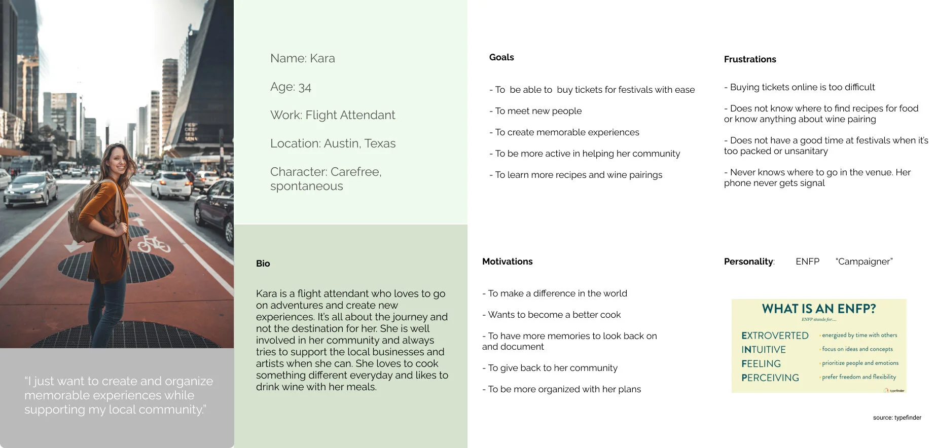
User Persona
After our very intensive mapping and grouping of user data, we were able to put together the key goals, frustrations and motivations of all the users. This cumulative review allowed us to create one identity to represent all of our users to give us the an idea of what goes on in a typical user’s mind when viewing the previous Rooster Grin website. This allowed my team to really focus on the user’s pain points and to make our design more solid. From the user test data, we found out that a festival like this was more catered to a mature audience ranging from the ages of 25-60 years old.

Desktop Userflow
From our research and interviews, we realized that all of our users said they only purchased tickets when on a desktop or laptop since a lot of information and planning is needed. They said they wanted to be able to see all the information at once.

Mobile Userflow
When it came to looking at the festival schedule and talent lineups, users said that they preferred to see that information from their phones. Reason for this is that they wanted the flexibility and portability of carrying a virtual map. In this case, we created methods for them to really plan out their schedules on the desktop and get a feel of how their days would end up looking like.
Usability Testing
Since we had a different approach for both desktop and mobile websites, we had to test if our designs were intuitive enough for the users.
For desktop, the main goal for the user is to purchase their tickets. But usually, someone going to festival away from home would want to make sure that their stay will be accommodated for. So we designed the website to flow through this exact process of find out where they could book a hotel near the festival. The cool lunch spots near the hotels were also placed near the same area as the hotels to make it easy for them to plan their trip.
As for the mobile design, planning and preparation were the most important aspects from what we gathered from the user data. In testing, we had the user find their favorite chef and download his/her schedule. After that we wanted to make sure that if the user wanted to check their phones to see what interesting community events were near them.
Prototype
It all begins with an idea. Maybe you want to launch a business. Maybe you want to turn a hobby into something more. Or maybe you have a creative project to share with the world. Whatever it is, the way you tell your story online can make all the difference.
