

Project Overview
Rooster Grin Web Redesign
Role:
Research / Information Architecture / Visual Design (Team of 4)
Tools:
Figma, Sketch, Photoshop, Miro
Context:
Client Project
Time:
2.5 week Sprint

Rooster Grin
Rooster grin needed a redesign of their current website to expand their web design business to cater to other companies. Their current site is a mess. It was made by a developer when the company first started. Rooster Grin needed help to implement their new goals and support their expansion. Rooster grin wants to move in a slightly different direction but their design team is small and does not have time to work on their own website as they have prioritized their clients’ site over theirs.
Problem and design hypothesis
The problem is, most of their clients come from dentistry and orthodontic backgrounds through networking and referrals. They wanted a design that is friendly, approachable and modern. They wanted UX Designers to help with the ideation and redesign of the website, both on desktop and mobile devices.
The solution
Rooster Grin would like to expand to more customers and increase web design and management sales. Rooster Grin would like their website to reflect their design ideals and attract/convert new clients. The website needs to meet user needs and reflect the company’s brand/business goals. My team and I had to meet certain goals as requested by the client.
To empathize with the users by designing a responsive website that is easy to navigate
To redesign the Rooster Grin website to meet user needs and reflect the company’s brand and business goals.
Make the site welcoming to users in all verticals, not only the medical industry.
To incorporate a subscription or call to action system to get in touch and bring in more clients
To achieve an overall good design and brand identity with clear services
To speed up their onboarding process
What We Did
We designed both a desktop and mobile friendly experience that promotes. Rooster Grin had drawn inspiration from other competitors for their redesign and all of them shared the same characteristics. We took those characteristics and compared them to research that we had done. We needed to make sure that we satisfied both the user’s and client’s needs. Rooster Grin told us specifically that they wanted their identity to be friendly, alive and clean. So we made sure to apply those to our interface design while making sure user’s enjoyed their experience on the site.
Competitive Analysis
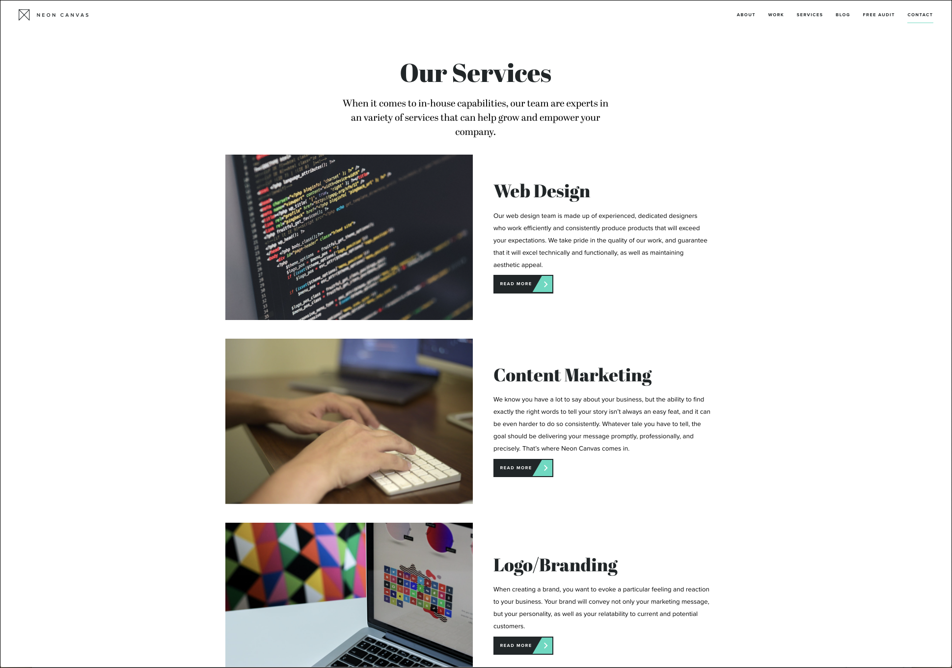
I was tasked by my team to pinpoint exactly what and who inspired Rooster Grin. Luckily, the client gave us a list of direct and indirect competitors. As I intensively did my due diligence, I realized that most of the direct competitors had the same things in common such as content hierarchy, similar sitemaps, multiple call-to-actions and a distinctive brand identity. Neoncanvas and Mail Chimp were good examples of those.

Comparative Analysis
In performing comparative analysis on some of the marketing websites that inspire Rooster Grin, I was able to pinpoint elements that were common throughout most of the websites. Three goals for their redesign of Rooster Grin are for it to be friendly, alive and clean.
Overall good design
Strong call-to-actions
Efficient service/work sections
Photojournalistic approach
Typography and layout
Features
Content hierarchy and features are very important to the success of the Rooster Grin website. At any time, a user can leave the site if they do not see anything appealing. The potential user wants to make sure that the company fits their needs at quick glance. So naturally, the first content they see, should grab their attention and make them feel welcomed to ask for a quote or inquire more information.
Call-to-actions
The users are able to get in touch with Rooster Grin support service through a variety of methods strategically laid out across the website. Key words that extract empathy from the users were also used.
Questionnaire
As another method of getting the attention of the user, we implemented a design quiz using a banner of every single page. This way, we would get more information from the user before the we call them. The more methods we used, the higher the chances we get of conversion.
Responsive Design
Creating a website that was available on both desktop and mobile was necessary to maximize client conversions. We wanted to make sure that the users would be able to make contact with the Rooster Grin from either platform by making the interface simple and intuitive.
Efficiency
I wanted to make the process of a user getting in contact with Rooster Grin very straight forward and seamless. In this case, for mobile, I included all the contact information they needed as well as an efficient process for them to give their emails.
User flexibility
We wanted to implement a calendar feature to our contact method to make it more convenient for the user. We also made sure that we would only make this option available after they fill out their contact information. It is their choice if they want to schedule an appointment or not.

Distinctive brand identity
We really wanted to make the business stand out from the competitors while also making sure we stayed true to Rooster Grin’s proposed brand identity. We made sure to incorporate the business’ goals and user’s need while chasing the three themes of being friendly, alive and clean.
Visual Design
As for overall visual design, the client wanted the website to be intuitive and simple for the customer to navigate through the site and find what they without really thinking about it. A photojournalistic approach with heavy images and minimal text to bring attention to Rooster Grin’s work and services.
Typography and layout
Typography and layout had to be curated and tested by our team carefully. We wanted to make sure that there was enough negative space and little clutter so that the user could read the services and case studies carefully. Bold typography was used to really make the little text we had stand out and make a statement.
Color Palette
The client made it known to us that they wanted to have purple as one of their branding colors. So we decided to use that color to add pop to a minimal redesign. This made the site feel more alive than sticking to monochrome.
Before
After
Research
Research was very much needed because we really wanted to be able to balance the user’s needs with client’s. We knew what the client wanted to see and what they wanted implemented, but we also knew as user experience designers, that the user interface is only half the process. So we interviewed 8 people, for about 30mins each, during our 2 week sprint and we made sure that everyone’s business experience fit into different verticals to support the expansion our client wanted.
Development
After finishing up the last of the interviews, we compiled responses into specific insights. We then took these insights and organized them on a shared board. We started to notice some on-going trends between users
Throughout out intensive process of putting the data from the user interviews together, we came up with common themes relating what the user’s expected out of a website of this caliber.
“I want to see a brand statement”
“I’m not made aware that I should get more info by contacting them”
“I evaluate if a design agency is right for me by their website design”
“There is little to no information about the company and I do not see a clear brand identity on this website”
— Joey Ng (Restaurant Owner)
“I would not use this site because it does not cater to my needs or my business. "
— Kaz Hiroshi (Entrepreneur)

User Persona
After our very intensive mapping and grouping of user data, we were able to put together the key goals, frustrations and motivations of all the users. This cumulative review allowed us to create one identity to represent all of our users to give us the an idea of what goes on in a typical user’s mind when viewing the previous Rooster Grin website. This allowed my team to really focus on the user’s pain points and to make our design more solid.
Desktop User Flow
User Flow
When decided to create a user flow for our persona because it allowed us to really see the steps of action a user would use when viewing our site. We had it start from what we had planned in our content hierarchy. We made sure that that user would be able to make contact with Rooster Grin at any point of the process eventually leading them to taking the our questionnaire or straight to the contact form and information.

Preliminary sketches
After doing research and interviews with some users, we were able to finalize our information architecture. We then created low-fidelity sketches to get an idea of how we would put the information together. After creating multiple iterations of how I envisioned Rooster Grin to look like, I settled on my first design choice. I was glad that I got to really focus on the home page because that is the first page a user sees and usually makes their decision quickly based on that page.
Usability Testing
Users found the navigation confusing on the original site. Our testing goal was to find out if our redesigned navigation was intuitive for users. The way for us to know if we improved the site’s navigation was if users could easily and quickly complete each task. We tested to see if our call-to-actions buttons were intuitively labeled if it only took the users 1-click to complete each task.
We noticed that many of our users were confused with so many different call-to-actions throughout the site with different context for each one. So what we did was consolidated the three different features into two.
Another common pain point for users was that they really wanted to see an actual phone number on the contact pages as well and not just a scheduled call or email. Users really wanted the option of being able to make a call instantly so we implemented those phone numbers into multiple areas of our site.
Lastly, users had shown frustration to the fact that we did not have much preface or background to why they should be taking the questionnaire. They wanted to know why it would benefit them. Knowing this, we implemented the preface text to incentivize the users more and to make them feel more comfortable with the process.
See it in action
Check out the prototype that we made highlighting the features of the redesigned website.